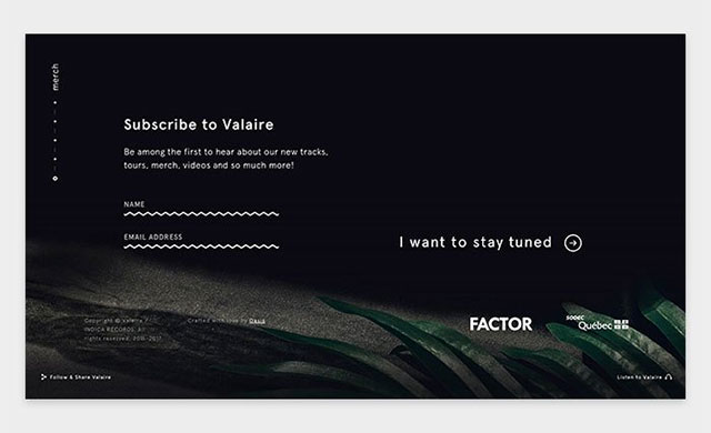
7 popular typography trends in website design
 Typography is the style, layout and appearance of the printed letters / texts on the page. Currently, it has already become an integral element of web design. You will find many interesting articles on the topic in the corresponding section of our blog, which has replenished today with another publication. Consider the design trends that are relevant for this direction that appeared and consolidated in 2018. The material will be a great addition to the web typography record. The post is a translation of this note.
The purpose of any site is to attract the attention of visitors. At the same time, it is important not only what you are going to convey to the audience (content), but also how you are going to do it (design). In 2018, content continues to thrive, thanks to enthusiasts of the Content First concept, which implies its primary importance in the design of web projects. Below are the typography trends of 2018, many of which involve placing text in front, in the center, and even across the entire screen. Continue reading
Interesting features of UI design in different countries
 When you create an interface design for applications / sites operating in different countries, you should take into account the peculiarities of national cultures and traditions of the corresponding target audience. Today we publish a translation of an article from the international company Cuberto, which is engaged in outsourced design and has experience in working with customers from all over the world.
In the article, experts share their impressions and important nuances regarding the UX / UI design of several countries: Japan, the USA, the Russian Federation, China, India and others. You could apply these practices and approaches to your professional activities. The entire animation is taken from the original note (perhaps it will be loaded a little longer than ordinary pictures, but more clearly).
JAPAN
In this case, we will talk about a Japanese startup, similar to the Uber mobile application, but with its own control system. To design the user interface, a “cartoony” style was chosen, which was reflected in the choice of certain color shades, fonts, and other graphic elements. Continue reading
How to make a color palette for a site and not only
 In Design Mania, there have already been several publications with similar topics: in a note about color matching services for websites, in addition to inspiration resources, we examined a couple of useful web tools; there was also a post with an overview of palette generators, etc. However, without understanding the logic of how to make a color palette, all of them may turn out to be ineffective. Today we will try to fill this gap and clarify some theoretical points that are well described in this article.
Those of you who have already used new-fangled online generators are aware of their principle of operation: first you select some basic values, configure a number of parameters (the names of which resemble some musical terms), and then as a result you get a list of 4- 5 shades recommended for developing web projects.
Colors from the palette Continue reading
Top Web Design Articles, Downloads, and Inspiration
 We continue the annual tradition and publish the most interesting notes for the “last season”. Earlier in Design Mania, you could already see a similar article for 2017 and a selection of the best posts in 2016. It seems to us that such a digest allows you to quickly view the most relevant materials and, possibly, save something for yourself in bookmarks.
For your convenience, the entries are grouped according to different topics that correspond to the sections of the blog: there are notes about logos, web design in general, icon / font archives, templates, textures, useful sevries and programs, and, of course, inspiring graphics. In total, about 55 links turned out, which completely coincides with last year’s indicators. In 2019, we hope to slightly increase their number + to finish updating the design of the project. Continue reading
How to make a website footer: design options, why you need it, tips
 Home »Web Design» How to make a footer of a site: design options, why it is needed, tips
How to make a website footer: design options, why you need it, tips
basement of the site Developers often overlook that the footer for the site (translation from English footer / basement) is one of its basic elements. It can provide more complete information about the company, and also performs various useful functions: it facilitates navigation, helps visitors navigate a web project and is useful for some commercial purposes.
Earlier in the blog, we examined the development of the website header, and today we’ll talk about the basement. Here you need to competently approach the choice of control components that will be included in it in order to get an effective and optimal solution. We bring to your attention a translation of the article from Agentestudio, which contains the best practices on the design of the footer and its illustrative examples. Continue reading


